Overview:
StrongLifts is a weightlifting workout tracker app created by Mehdi Hadim in 2007 — a lifter, coach, and author with over 25 years of experience. The app helps users build strength and muscle efficiently through structured training programs and progress tracking.
Task:
Analyze the existing StrongLifts website and develop a design system that supports a new, user-focused web dashboard. The goal was to design an experience that helps lifters understand their progress effortlessly and stay connected to their training journey through clear, accessible data visualization.

Section 01
Understanding the Brand
“Strength made simple.”
At its core, the StrongLifts brand idea is delivering real, measurable strength gains through a minimal, repeatable system that athletes can trust. It promises that you don’t need endless complexity, flashy workouts, or gimmicks to get stronger — just the right dose of consistency, structure, and incremental overload. The brand positions itself as the trustworthy guide: straightforward, unapologetic, and results-driven.
Visual Design Audit
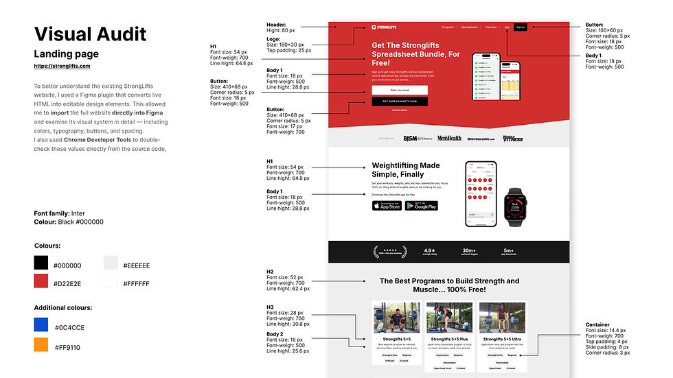
I conducted a visual audit of the StrongLifts website using Chrome developer tools to inspect individual design elements such as typography, color, and layout. I also examined the mobile experience by reviewing the app. These visuals offered valuable insight into the app’s user interface, color palette, and iconography.

Section 02
Design System
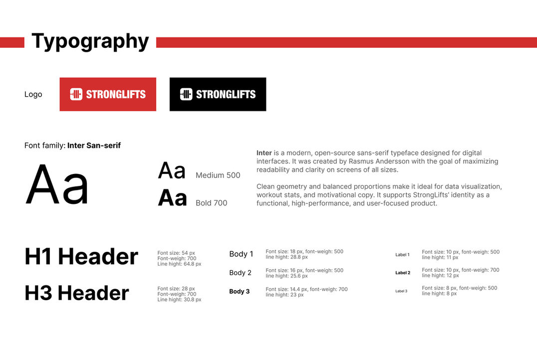
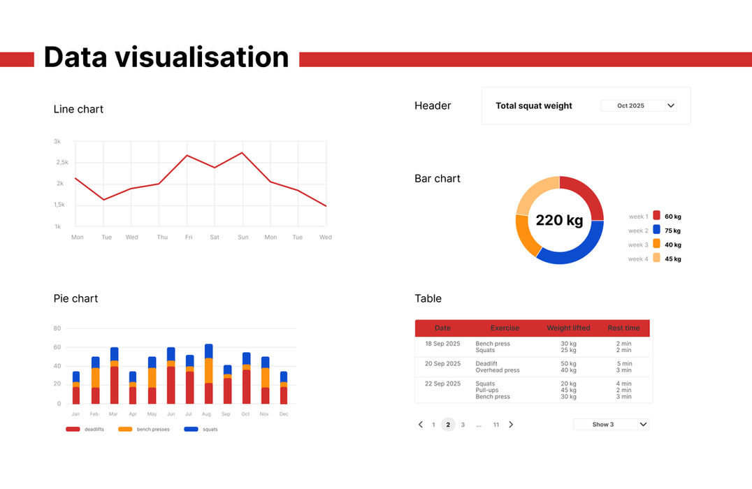
In this project, creating a design system was essential to align the new dashboard with the existing StrongLifts website and to introduce clear visual rules for data visualization and interaction patterns. This approach ensures that the product remains both scalable and visually consistent as new features are added.
Section 03
Dashboard Design
The final design brings together all insights from the brand analysis, visual audit, and design system development. The StrongLifts dashboard focuses on clarity, motivation, and usability — helping users easily track their progress through clean data visualization and a consistent visual language that reflects the brand’s identity.

Design Decisions
Consistency and Simplicity
By following established UI conventions and the design system, the interface remains predictable, clean, and easy to interpret, which supports both novice and advanced users.
Motivational Design
Highlighting achievements and progress statistics supports user motivation. By making improvements visible, the design helps users feel rewarded and inspired to continue training.
Clarity and Focus
I structured the dashboard layout to ensure visual hierarchy and minimize cognitive load. Key metrics are immediately visible, guiding the user’s attention toward their most relevant progress indicators.
Personalization
The inclusion of the user’s avatar and name, along with a welcoming message, strengthens emotional connection and a sense of ownership within the app.
Usability and Findability
The global search and clear navigation ensure that users can quickly locate workouts, stats, or settings without friction, supporting efficiency and confidence in use.


